The data set is piracy. This data set is available on openintro.org/data and in the `openintro` R package.
Napster. Limewire. Frostwire. Kazaa. These are but a few of the peer-to-peer file sharing programs used heavily in the early 2000s to pirate copyrighted media, especially music and movies. Napster was shut down after a lawsuit from the Recording Industry Association of America (RIAA) for copyright infringement under the Digital Millennium Copyright Act (DMCA). The other software companies closed doors soon thereafter. However, the DMCA only applies to US based companies.
The `piracy` data set contains information about funding members of congress received due to legislation similar to the DMCA that applied to international companies. PIPA and SOPA - the Protect Intellectual Property Act and Stop Online Piracy Act - were introduced to congress in late 2011 and aimed to make it hard if not impossible for international websites to sell or distribute pirated copyrighted media (among other things).
This data set is also focused on the financial impact of this legislation. Not the impact to the recording industry or the movie industry, but to the pocketbooks of the legislature. Two of the variables in the data set are money_pro and money_con. Both represent the amount of money each congressperson received - in the form of campaign donations for the 2010 election cycle - by lobby groups for (pro) or against (con) PIPA and SOPA.

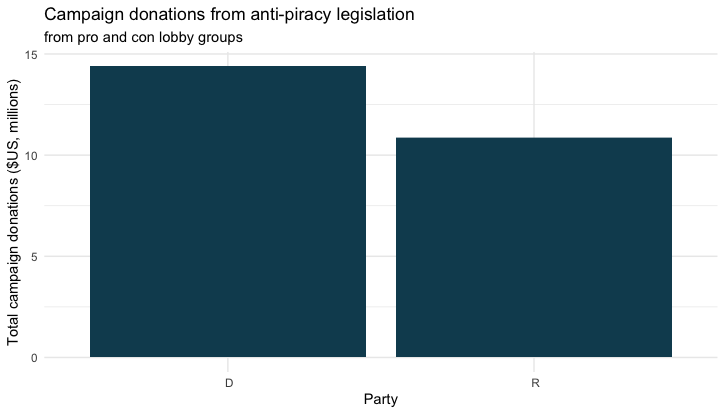
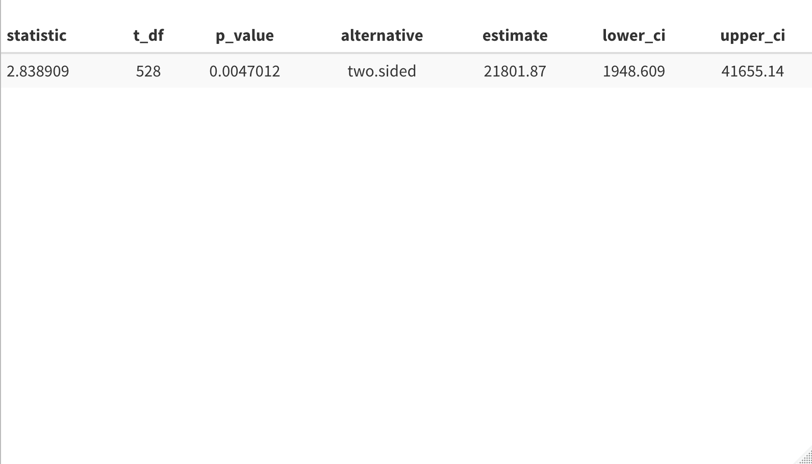
I use this data set in my lab on two-sample t-tests. In the lesson, we run a test to see if one political party received more in campaign donations than the other, regardless of which lobby group the donation came from. As shown in the plot above, it appears that Democrats received more funding. After a bit of data cleaning, we arrive at the results below. Note: the test was run at the 99% confidence level and an order of D, R.

As we can see, it appears that Democrats received more in campaign donations than Republicans. After completing this in class, students are tasked with running a test to determine if the party of their choosing received more from pro lobby groups than from con lobby groups.

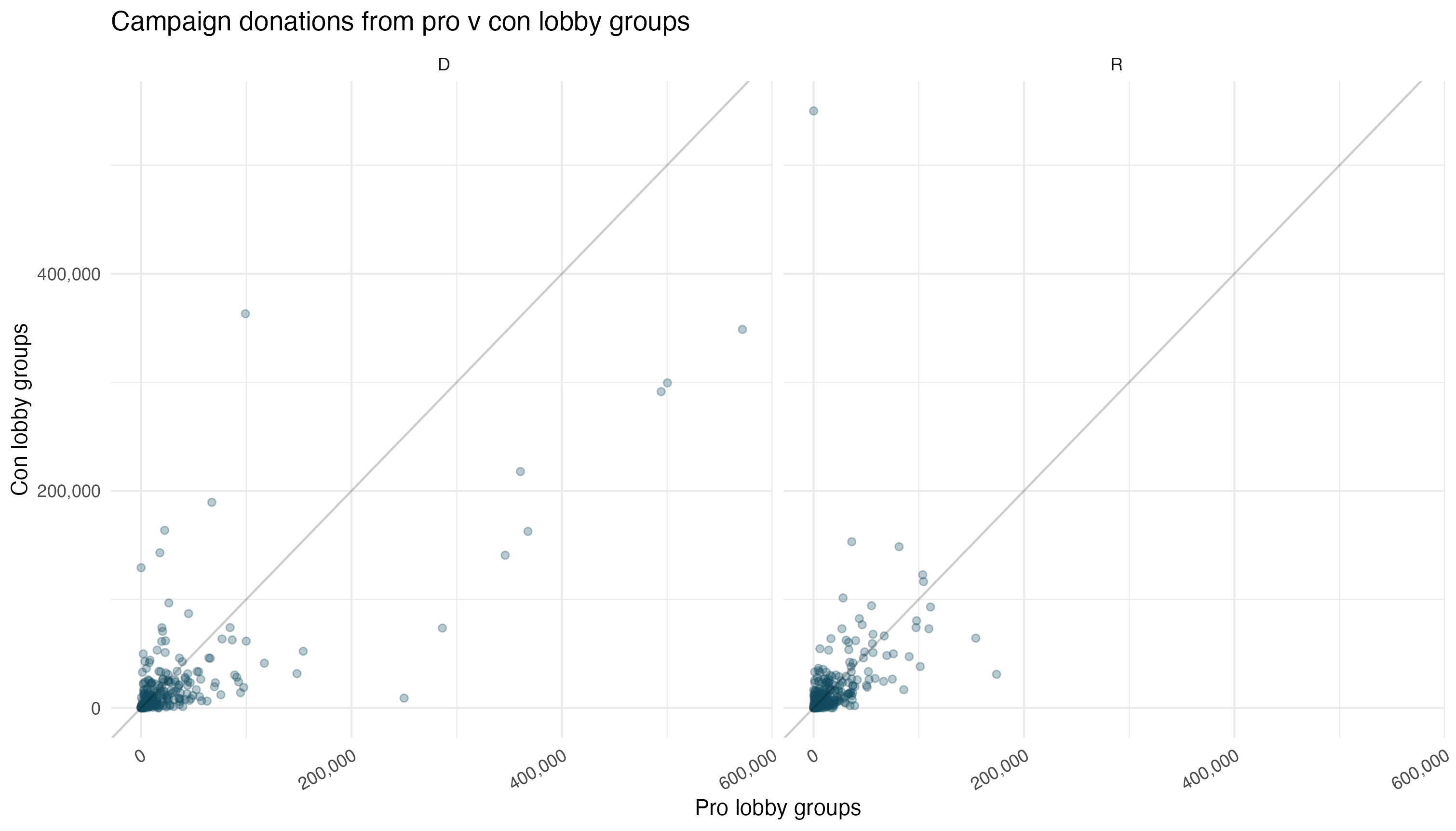
In the above plot, points above the line represent a congressperson who received more donations from con lobby groups and points below the line received more from pro lobby groups.
Looking for a deeper dive into this data set? You can check out a past analysis by Luke Paulsen, who interned at OpenIntro in 2012.
